The objective was to re-position the Robertson brand so that it reflected the idea of constant evolution. A brand evolving to meet the changing needs of the market; and which sources and supplies award-winning kitchen and bathroom products. Robertson, which distributes three industry-leading brands, needed a unified brand family that allowed each product brand to have its own unique personality.
Working alongside the senior designer, I created an intelligent and lateral approach in the Robertson ‘ribbon’. It recalls the idea of water and the sensual forms, surfaces and spaces within the bathroom and kitchen environments. This flexible solution allows each product brand to have it’s own personality, brought to life with its own unique colour system while still representing the same visual Robertson form and identity.
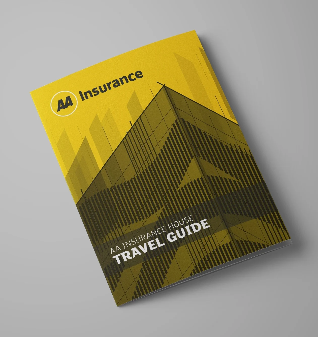
In 2018 AA Insurance moved into to a brand-new office building and needed a Travel Guide designed to help staff find their way around the new building and also find each other easily across 3 huge floors. In aid of this, I put together a small book which folded out into a colour-coded map showing where each business unit and team were located as well as various other amenities and important features.
The booklet was printed on eco-friendly, recycled paper to match the green credentials of the new building. The cover was printed on yellow paper stock which was colour-matched to AAI’s brand and with white ink. The cover design is an illustration with inspiration derived from the building’s facade.
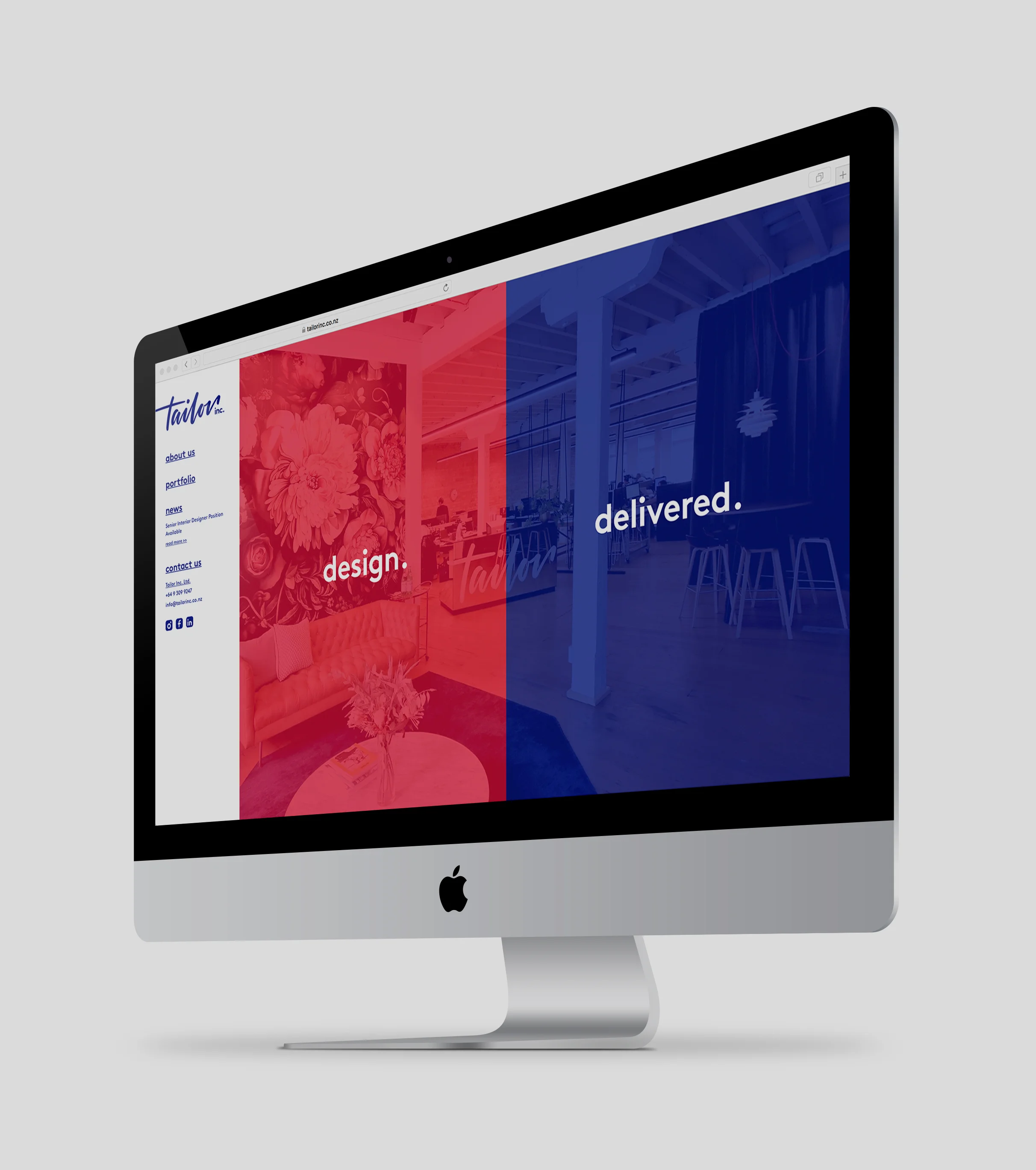
A fully responsive, bespoke website created for Tailor Inc. A leading interior design and project management company based in Auckland and Tauranga.
The website was designed with the intent of showing the dual nature of Tailor’s offer equally, offering the visitor a choice as to which service to explore first. Interior design (design) or project management (delivered).
Once clicked, the innovative slider animation ensures the page transitions are seamless which helps users navigate the website and recognise that they are still able to click on the design or delivered section, no matter where on the website they are.
You can see a short video here, showing how the animation works.
The website was also built with a CMS back-end allowing the client to continually update the site with their latest projects, staff and news.
The aim of our rebrand was to capture the uniquely charming feel of our agency and the approach that we bring to all our client relationships. The unique logotype was designed to be strong and distinctive and little touches of charm were added to our business cards and compliment slips.
I chose black and gold as our primary colours with a purple accent and used a gold metallic stock for our business cards.
Here you can also see some spreads from our creds book.
Synergy Group required a rebrand to enable the company to better present their proposition - to make transformative technology available to all through their suite of businesses that specialise in the creation, sale, services and rental of intelligent technology.
To further this goal it was important to develop a strong parent brand which could then be applied across the other businesses within their group.
The new brand was a complete redesign with new colours and a more modern and transformative look using a set of shapes which can move, transform and be applied as a recognisable and powerful extension of the brand.
A full set of guidelines was developed along with building signage, vehicle branding and other branded content.
In early 2017 I was approached to help launch a brand new geo-spatial and survey company offering services in unmanned (drone) aerial mapping, advanced surveying, 3D laser scanning and machine automation. This new business required a name, logo, branding and a website that would bring to life it's vision and scope and give it a differentiated voice in the market.
After a workshop with the client we identified the strategic objectives and competencies along with the target market and user journeys for the website. This groundwork allowed me to develop a strong brand personality and to develop a detailed brand framework and positioning for this new business.
Introducing Recon – New Zealand's most advanced geo-spatial and survey specialists.
At the start of 2017 I became involved with the launch of a new craft beer brewery, Urbanaut Brewing Co. based in Kingsland, Auckland.
Having already developed a strong brand with their previous agency based in Wellington, The guys at Urbanaut were looking for a local company to take the brand forward and to roll out their packaging on their soon to be launched beer range.
I illustrated a number of detailed city-scapes for the new beers which have been brewed with famous locations from around the world in mind. Each Urbanaut beer is designed to celebrate the city that inspired it's creation. Whether you know the destination well, or yearn to explore it someday, each beer embodies the culture, the people and the atmosphere.
It was vitally important that each illustration captured this spirit and uniquely represented it on the product.
In 2011 Paper Plus sponsored a charity dinner promoted by Duco Events and featuring Lord Jeffrey Archer. I was tasked with branding the event and the design of various collateral to promote the dinner including newspaper ads, a DL brochure and a programme. Hugely pleased with our design and service, Duco asked us to then design the look for their next charity event - Sir Richard Branson Live in Auckland.
Feedback from Duco, the sponsor Bank of New Zealand, the charity Outward Bound and guests at the sold out event was extremely positive.
Deliverables for each event: Event logo/lockup, Promo DL/A5, 100+ page programme, posters, several powerpoint presentations and advertising, along with a microsite.
The company Christmas card is always a great opportunity to wow your clients and give them something special that means they'll have you front of mind when it comes to booking in new work in the new year. Of course keeping to a budget is also pretty important too since it's hard to show ROI when you're doing your own promotional work.
For this project I came up with the idea of designing and creating a customised paper Christmas wreath which was constructed by hand from 22 laser-cut shapes. The paper is four different stocks which gives the wreath a really nice textured feel and was sourced at a very generous rate from one of our suppliers. As an unintended result of the laser cutting the paper also gave off a faint burnt wood smell which helped heighten the Christmas feel of each wreath.
Each wreath was then tied with a ribbon to hang it from a tree and placed into a small slide-out cardboard box. A card with a message sat perfectly on top to hide the wreath and the box was then tied with a ribbon.
Each box and accompanying hand-written card was stamped with a custom stamp I designed with a message wishing our clients a merry Christmas. The stamp typography was also bespoke for this project. Using a stamp also kept the cost down and complimented the handcrafted feel of the whole project.
Although it was very labour intensive creating 70 wreaths, constructing and hand-stamping the boxes and tying up and cutting all the ribbons, I was hugely proud of the end result and feedback from our clients was amazing.
A poster I designed as a handy visual guide for a studio I was working in at the time. We often had requests for printing and having the poster hanging on the wall made it simple to show the different sizes of print which we could produce for clients.
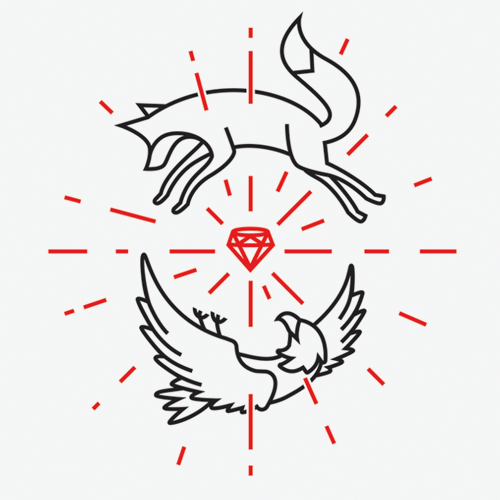
A personal project, this motif was designed as a gift for some friends of mine on their child's first birthday.
Their family names were Fuchs (which is German for fox) and Hawkins and they combined them into the surname Hawkfox when they married.
Their baby daughter is called Ruby.
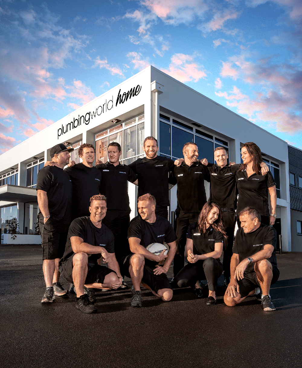
After undertaking market research we discovered that many consumers believed Plumbing World was not for them and that they didn’t consider shopping there.
We needed to show consumers that though plumbers shop at Plumbing World, they could too.
Enter Plumbing World Home. With rebranded showrooms at its core, we created a new consumer-centric brand and a clear message: Plumbing World Home is for you.
Included amongst the new collateral was new photography which I art directed and also retouched, you can see a behind-the-scenes video of the shoot here too.
I created this identity for two good friends of mine who have recently opened a B&B and backpackers in Kingston, New Zealand. I felt it was important that the logo reflected their own DIY style and also uniquely captured the raw and rugged beauty of the South Island. The type was hand drawn to reflect this.
The logo was also created as 4 separate single colour logos for use as stickers/decals on snowboards.
The brand was extended across t-shirts, hats and stickers as well as signage around the lodge.
An 88 page book produced while freelancing for M2M, for their CPD Gold Submission.
CPD stands for Continuing Professional Development. It refers to the process of tracking and documenting the skills, knowledge and experience that are gained both formally and informally as people work, beyond any initial training. Companies document their CPD initiatives and then submit a record to gain certification which then marks them as being an attractive organisation to work for.
The book was designed and printed under very tight deadlines so simplicity was important. The book also had to be easy to browse quickly and display the information in a manner that was easy to digest.
This illustration was part of a self initiated project focusing on some of London's beautiful architecture.
I submitted Ashmere Grove into the 2014 Aquent Talent Calendar and I was hugely proud to have my Illustration picked to feature in the calendar alongside 12 other illustrators from around the world. The Calendar was given as a gift to all Aquent clients and customers internationally.
I continued the project with another illustration – Hyde Park Mansions, which you can view here.
The M2M Explorer's Journal was a book designed as part of an internal initiative, the purpose of which was to define M2M as a company. The idea of an Explorer's Journal was a scrapbook where individuals could observe and document the world around them. The book contained several exercises and on completing each section in the book, insights could be ascertained and valuable knowledge gained which would then be applied in further steps as employees worked through the book. The end result would yield powerful marketing ideas and awareness which would then be passed on to the client or utilised in M2M-led campaigns.
It was important that the book reflect the scrapbook idea, that it look hand-written and chaotic. To achieve this custom text boxes were setup to ensure that each paragraph looked unique. Visual elements were used from maps and images were also chosen to reflect the idea of an explorer documenting the patterns and similarities that can be observed in the natural world.
CourierPost has always been the leader in new technology in the New Zealand courier market and they take the same approach when it comes to their environmental practices.
We were asked to design a ‘look’ for the new range of ‘eco-friendly’ trackpaks. Made in New Zealand from recyclable materials, it was essential the design reflected this.
As part of our work for Auckland Theatre Company we were tasked with designing an identity and printed collateral (including advertising) for all of their productions.
I was asked to design the look for the production of Arthur Miller’s classic play, The Crucible. The hero image was extensively retouched and used across the different promotional material. Some of the printed collateral included a flyer, magazine and newspaper advertising, posters and a programme.
Deliverables: Promo flyer, A3/A1 posters, various media adverts and a 32 page programme.
A selection of logos I have designed for various clients.
A small 210x210mm book designed for EuroTunnel Le Shuttle to show customer segmentation research which had been completed by OMD UK.
The brief was to present the information about different customer types and their media consumption in an easy to digest and informative way so EuroTunnel Le Shuttle could design advertising and promotions to target specific groups and more effectively communicate with their customers.
Each group was coded with their own colour and a set of simple infographic style designs was used to illustrate each data point.
An infographic designed to illustrate a series of studies done by Leo Pharmaceuticals on the treatment of Acintinic keratosis on the skin
Some work I did as part of a personal branding exercise. The blue hello text was sketched first and then traced in Illustrator. The animated hello! was created in Illustrator and then animated in Photoshop.
This illustration was part of a self initiated project focusing on some of London's beautiful architecture.
This illustration is the second in my series of London architecture, Hyde Park Mansions - NW1.
See the other illustration in the series here
A cursive display font I designed in Illustrator as a personal project.
An infographic designed to show how people's media consumption changes during the day. The infographic also shows the differences between male, female and joint media consumption.
This was developed for a client to show them the best times to target their advertising for maximum impact.
As a premium urgent courier service, Pace take pride in making sure that their service is second-to-none. When delivering flowers, not only must the delivery be speedy but also care must be taken with the delicate cargo.
This campaign was aimed at florists purchasing their flowers wholesale at the flower markets in the very early morning. Free coffee was provided along with a clever flyer which sat on top of the coffee cup to resemble a sunflower as well as a demonstration from Pace about their capabilities and service.
Photography is a one of my interests and I love seeing the world from a different perspective. Here you can see some selected photos I've taken in my hometown of Auckland and also from my travels around the world.
Click on a thumbnail for full size and then browse with the left right arrows on your keyboard.
A self initiated monogram design which I illustrated for a group of friends.
A rough timelapse I took from the kitchen window of my flat this Autumn. Shot looking north up Highgate Road the timelapse is made from around 1500 still images. On the left you can see the trains leaving and arriving at Kentish Town Station.
Colours tweaked and video cropped in After Effects.
Click the Vimeo logo on the bottom right of the video to watch in HD at vimeo.com.
Featured on www.kentishtowner.co.uk
2009 marked the 20th year since CourierPost’s creation on 9 October 1989. Our brief was to create a logo which would be launched nationally on vehicles, collateral and on the internet as part of the company’s 20th anniversary celebrations.
I wanted to create something ‘fun’ and symbolic of CourierPost’s business and their journey over the past 20 years. The van has always been a large part of their business too, so I felt including this was appropriate.
In 2017 the agency I worked for pitched and were successful winners, becoming Plumbing World's agency of choice. My first job for them was to design their latest catalogue.
A fresh new look was developed with the feel of a luxury magazine. I also wanted the catalogue to be useful for those renovating their bathroom or looking to upgrade so I included some helpful tips throughout the publication.